Custom Line Chart In Appcenter
Published:
The Teradata AppCenter is a browser based tool for building repeatable applications. A script based app allows you to run parameterized SQL and visualize the results. There are several pre-built visualization options in AppCenter, but, if you go explore the World Wide Web, you’ll find a 1000s of javascript libraries that can be used to visualize your data.
For this reason, AppCenter includes the ability to upload custom visualization scripts. In this post we will explore this feature and use Chart.js to visualize the monthly rain in Seattle.
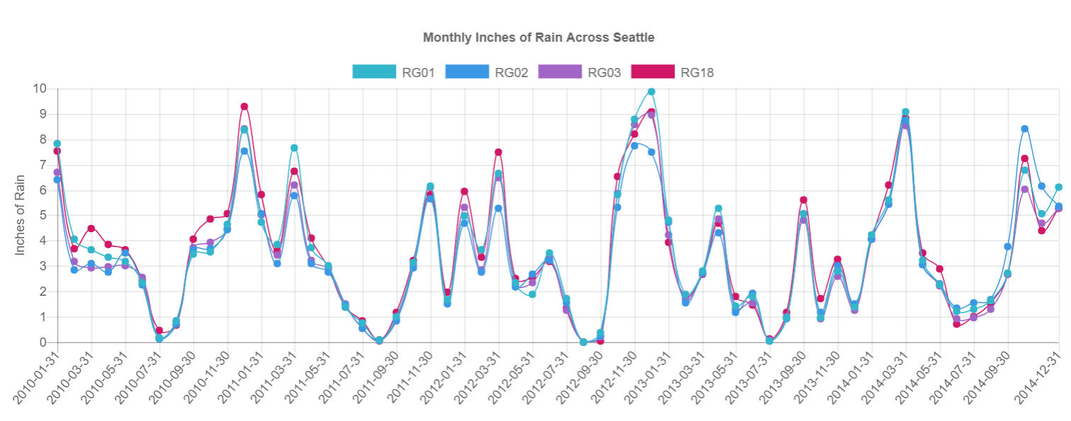
Spoilers first, here is the type of data we’re expecting and an example of the line chart we’ll create:
| rain_gague | end_of_month | rain_inches |
|---|---|---|
| RG01 | 2010-01-31 | 7.82 |
| RG01 | 2010-02-28 | 4.05 |
| RG01 | 2010-03-31 | 3.65 |
| RG02 | 2010-01-31 | 6.41 |
| RG02 | 2010-02-28 | 2.83 |
| RG02 | 2010-03-31 | 3.10 |
Files Needed in a Custom Visualization
There are 4 main types of files we will need to create our custom visualization:
- Any custom styling
- A page layout to hold our visualization
- A script that takes the results of a SQL Select statement as input, formats the data, and calls the visualization libraries we’re using
- Any libraries that we are using to visualize
External Libraries We’re Using
The backbone of this visualization is Chart.js. We’ll use their help docs to understand how to create our visualization, and the only real coding we’re going to do is prep data from our SQL call and use that data when we call Chart.js visualization functions.
The second library we’re using is chroma.js. This is a powerful, color related library, but we are only using it to generate a dynamic number of colors on a specific color range. This allows us to have a nice looking line chart without knowing ahead of time how many series of data (thus number of colors) we will need.
mystyle.css
In this visualization, we are not doing very much styling. All of our labels and visuals are being creating by the Chart.js functions.
body {
    background-color: white;
}
customviz.html
In our page layout we have two main goals:
- Import our style sheet and any scripts we will be using
- Save our SQL query results as the variable dataObjStr
- Call our createChart function (which we will build in the next script)
<html>
    <header>
        <title>Custom Visualization</title>
        <link rel="stylesheet" type="text/css" href="mystyle.css">
        <script src="Chart.bundle.js"></script>
		<script src="chroma.js"></script>
        <script src="myscript.js"></script>
    </header>
    <body>
        <canvas id="myChart" width="25" height="10"></canvas>
        <script type="text/javascript">
            var dataObjStr=$$$$$$;
            createChart();
        </script>
    </body>
</html>
myscript.js
Our createChart functions takes a specifically formatted table, prepares the data, and then uses the Chart.js library to build our line plot. We expect the input dataset to have specific column names and be ordered by series and then x label. Here’s a small sample of our input for our example line chart.
| srs | x | y | label_chart | label_x | label_y |
|---|---|---|---|---|---|
| RG01 | 2010-01-31 | 7.82 | Monthly Inches of Rain Across Seattle | Inches of Rain | |
| RG01 | 2010-02-28 | 4.05 | Monthly Inches of Rain Across Seattle | Inches of Rain | |
| RG01 | 2010-03-31 | 3.65 | Monthly Inches of Rain Across Seattle | Inches of Rain | |
| RG02 | 2010-01-31 | 6.41 | Monthly Inches of Rain Across Seattle | Inches of Rain | |
| RG02 | 2010-02-28 | 2.83 | Monthly Inches of Rain Across Seattle | Inches of Rain | |
| RG02 | 2010-03-31 | 3.10 | Monthly Inches of Rain Across Seattle | Inches of Rain |
//Function that is called in our HTML file
function createChart() {

	//Canvas in our HTML file
    var ctx = document.getElementById("myChart").getContext('2d');

	//results from our SQL call
    var data = dataObjStr.results[0].data;

	//Empty variables for the six required columns in our data set
	var series = new Array(); 	//SQL column: srs
    var xLabels = new Array();	//SQL column: x
    var yValues = new Array();	//SQL column: y
	var labelChart = "";		//SQL column: lable_chart
	var labelX = "";			//SQL column: lable_x
	var labelY = "";			//SQL column: label_y

	//populate variables
    for (var i = 0; i < data.length; i++) {
		series.push(data[i].srs);
		xLabels.push(data[i].x);
        yValues.push(data[i].y);

		//labels are repeated for every row, we only need them once
		if(i == 0 ){
			labelChart = data[i].label_chart;
			labelX = data[i].label_x;
			labelY = data[i].label_y;
		}
    }

	//get distinct values for our series and our xLabels
	series = Array.from(new Set(series));
	xLabels = Array.from(new Set(xLabels));

	//Get a unique, evenly spaced out color for each series
	var colors = chroma.scale(['#33b5cc', '#cf1766']).mode('lch').colors(series.length);

	//for each series, build the javascript to plot the y values
	//we are formating for the DATASETS option of Chart.js 's Chart function
	var ySeries = new Array();
	for (var i=0; i < series.length; i++) {
		ySeries.push({
			label: series[i],
			data: yValues.slice( (i * xLabels.length), (i * xLabels.length) + xLabels.length),
			backgroundColor: colors[i],
			borderColor: colors[i],
			fill : false,
			borderWidth: 1
		});
	}

	//Call the Chart function from our plottin library with our prepared data
    var myChart = new Chart(ctx, {
        type: 'line',
        data: {
            labels: xLabels,
            datasets: ySeries
        },
        options: {
            scales: {
                yAxes: [{
                    ticks: {
                        beginAtZero:true
                    },scaleLabel: {
						display: true,
						labelString: labelY
					}
                }], xAxes: [{
                    scaleLabel: {
						display: true,
						labelString: labelX
					}
                }]
            }, title: {
				display: true,
				text: labelChart
			}
        }
    });
}
Bundling the Files
Now that we have our files to build a multi-series line chart off of any properly formatted input dataset we need to bundle the files into a singl HTML file called bundle.html. This is done using node.js which you can install from here. Once installed (and added to your PATH if necessary) you’ll use node.js to install polymer-bundler:
$ npm init -y
$ npm install polymer-bundler
We’ll then do the following steps:
- Create the directory for this visualization
- Move myscript.js, mystyle.css, customviz.html, and any .js libraries we are using into this folder
- From the command line, and the folder directly above the folder you made in step one, run polymer-builder
$ ./node_modules/.bin/polymer-bundler --inline-scripts --inline-css FOLDERNAME/customviz.html > FOLDERNAME/bundle.html - In AppCenter, choose Custom Viz and upload bundle.html
Running the SQL
We do need to do some processing in our SQL statement to get the appropriate column names and chart labels. We are can also clarify which rain gauges we want to visualize because remember! our visualization can take any number of series
SELECT
	rain_gauge AS srs
	,end_of_month AS x
	,rain_inches AS y
	,'Monthly Inches of Rain Across Seattle' AS label_chart
	,'' AS label_x
	,'Inches of Rain' AS label_y
FROM mt_monthly_rain
WHERE 1=1
--ONLY SHOW 2010 TO 2015
AND EXTRACT(YEAR FROM end_of_month) BETWEEN 2010 AND 2014
--ONLY SHOW SPECIFIC GAUGES
AND rain_gauge IN ('RG01','RG02','RG03','RG18')
order by 1,2